Radically Open
Is it possible to produce good design on a product that you don’t fully understand? More often than not I’d say no but with Radically Open it was necessary to work a little blind.
Here’s what we do understand. Radically Open is a company built around a clinically researched therapy known as Radically Open Dialectical Behaviour Therapy, or RO-DBT for short. The company works by offering training events for other Therapists to learn about the therapy in order to better treat their patients. The website also offers further information on the subject of Self-Control and Overcontrol as well as a directory of Therapists for patients to search.
So while the details of what the therapy is and how if helps particular conditions is a little beyond our understanding, we do know the main goals of the business and it’s these we were able to focus on.
Getting Started
With the previous website built on top of a fairly generic WordPress theme it was clear that continuing with WordPress would be the best option to allow the client to continue to update the site themselves without the need to learn a new CMS.
Our role at Bronco was to introduce a new tailor-made design, expand the functionality and better organise the information to create a better flow for the user through the content. Together we’d deliver a more professional online image for the company as well as a better user experience.
Reinforcing the human element
Where our lack of understanding hurt most was when starting on the design. Our first goal in any design is to establish clearly its purpose to users, even in situations like this where a large proportion of users would be aware of Radically Open or the therapy before visiting the website.
This knowledge about its users allowed us to relax a little and have the content provided by the client act in this capacity; however as we often do, we reorganised this to ensure that we had a concise explanation about the website and therapy easily available.
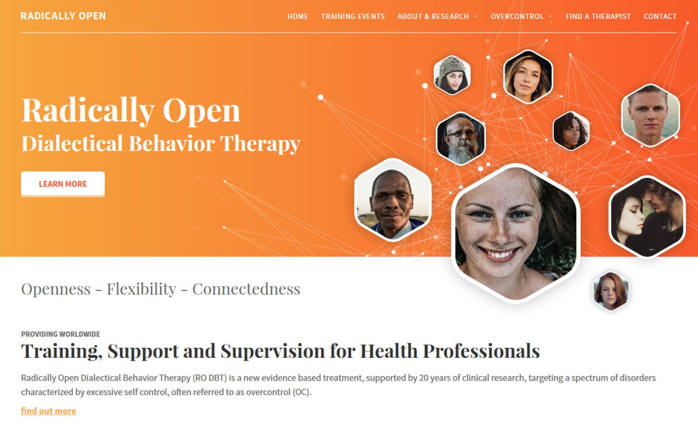
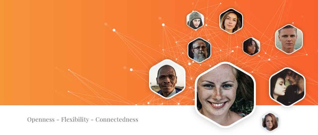
Next came the imagery which often plays into the purpose of the website. Without much imagery provided and having been steered away from mindfulness style images we eventually focused on using faces. Bringing in the human element helped reinforce the purpose of the website, though somewhat loosely, and by combining this with geometric shapes we played into the idea of connectedness present in the websites strapline.
The money maker
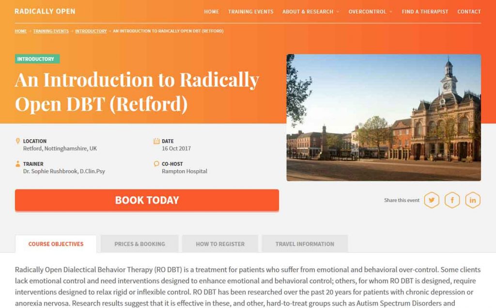
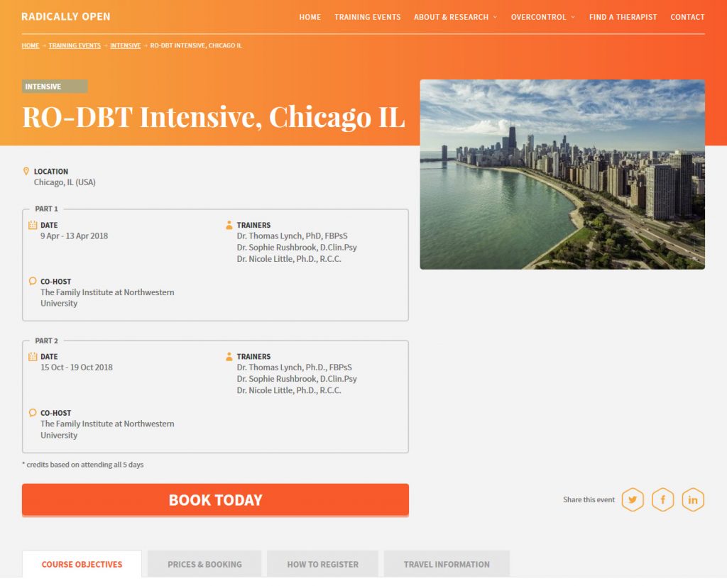
Training Events are the main offering of Radically Open and as such represents the most important section within the website. Through the use of custom post types, taxonomies and advanced custom fields developing this section was largely straight-forward and resulted in a user-friendly system for adding the events into the website. To simplify the workload for us the booking for the events would all be handled off-site.
But, unfortunately, it wasn’t all plain sailing though as hiding events that have passed took a little time to get right with some anomalies in comparing dates. The design proved something of a headscratcher too as the two different types of events, Intensive and Introductory, would display differing information within similar templates, so getting the design to work well for both was tricky.
Finding help close to home
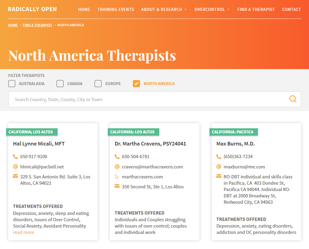
This proved to be the most complex section of the website. While custom taxonomies took care of grouping the Therapists by Continent there was also a desire to be able to drill down further, ultimately to city or town, as the list of Therapists grew.
While taxonomies suited a limited number of single level locations, which also allowed us to create a clickable SVG map, it didn’t feel like the best solution for multiple levels and possibly hundreds or even thousands of individual locations. So in addition to keeping the top level continent taxonomies we created an additional location field for the client to populate with a number of locations terms, both specific and generic that could be used as the basis of a new search field. This would provide far more flexibility and be easier to use for both client and user.
The finishing line
After testing, tweaking and the client populating the site with therapists and events the website went live mid-July 2017. Of course we’re pretty happy with another successful project completed, but more than that the client is happy with the result…
At Radically Open we are a small team of academics who are pretty naive when it comes to website design. We had an old site developed by a friend on a mac and wanted a new one that looked much more professional without looking too sales orientated (we work with mental health professionals in Europe and the USA). The team at Bronco were amazing at leading us through the process of web design – starting with the huge amount of information they require to develop the content, through understanding our particular goals, ethos and principles and coping with our inexperience of all things technical! We have ended up with a site which we love – creative, professional, easy for our clients to navigate and intuitive enough for us to edit. All done willingly, positively and quickly. We are delighted with the end product and wouldn’t hesitate to work with Bronco again.
Share this case study
Like what you’ve read, then why not tell others about it... they might enjoy it too
