Insolvency E-Market
Developing the Insolvency E-market website for a new Insolvency Marketplace presented Bronco with a unique set of challenges, distinct from those encountered when evolving an existing solution for an established company.
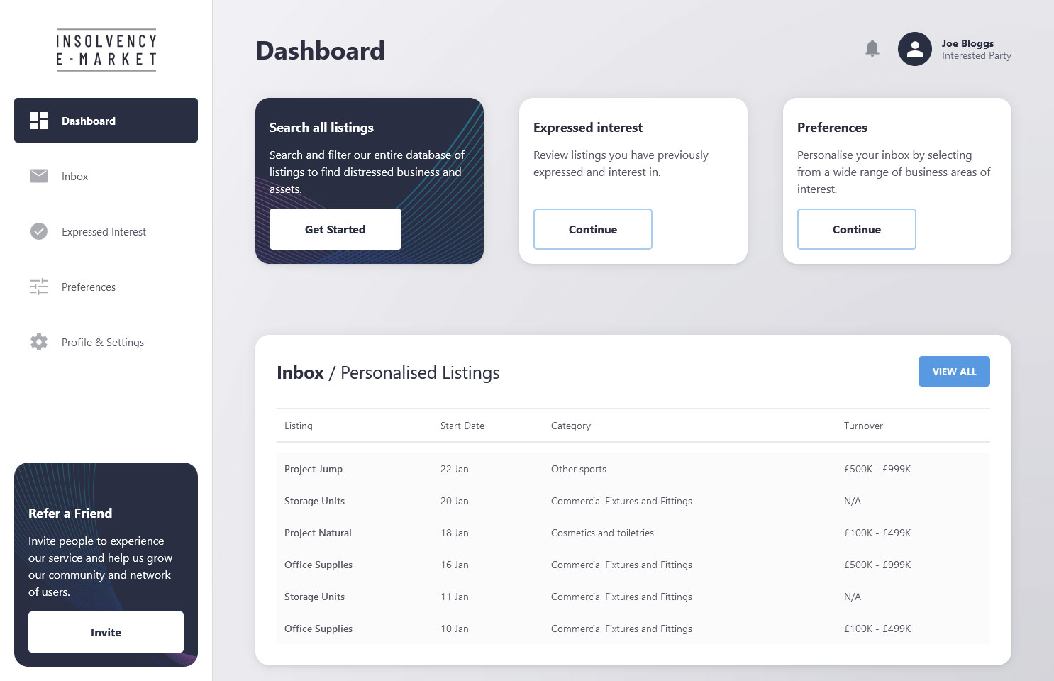
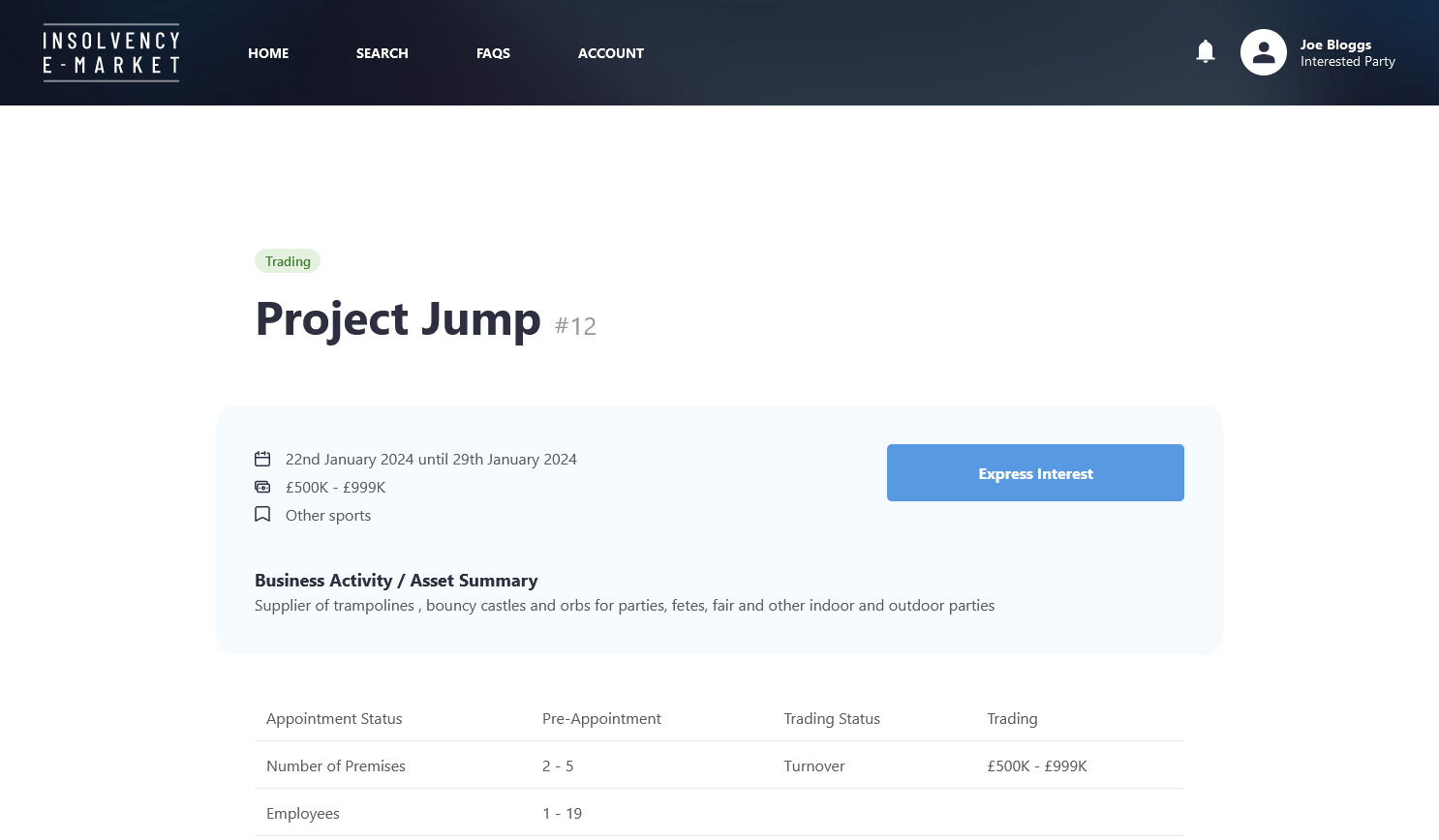
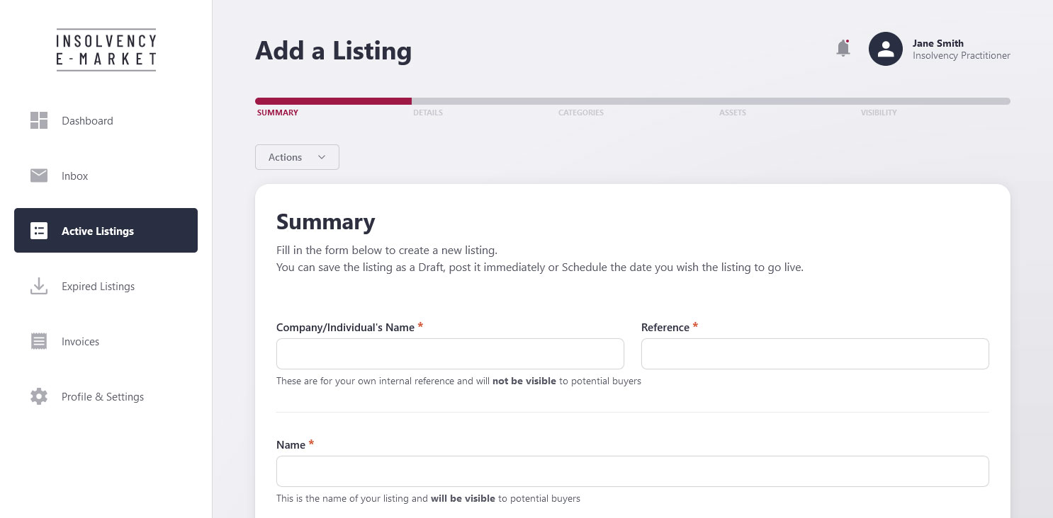
Adding to the complexity, the Insolvency E-market serves two distinct user groups: those listing insolvent businesses/assets and those interested in purchasing these listings. This required a distinctive approach to ensure that both sets of users’ needs were effectively met.
Navigating the Unknown
The primary challenge in crafting a website for a new venture like Insolvency E-Market was the lack of an existing digital footprint. Unlike the process of revamping an already established website, where existing user data and interactions provide vital insight, this project required building a platform entirely from scratch. The lack of historical user data presented raised questions about user preferences, effective functionalities, and design elements that would most appeal to the target audience.
In contrast to redesigning an established website, where historical data and user interactions offer valuable insights, this project required building a platform from the ground up. The absence of historical data raised critical questions about user preferences, effective functionalities, and design elements that would resonate with the target audience.
Strategy: Market Research
Bronco tackled this challenge by carrying out thorough competitor research to understand the conventions of the marketplace and to identify areas where we could deliver a superior solution. This research was vital in constructing a website that not only met but exceeded expectations.

Establishing Trust and Credibility
For a new business, establishing trust is crucial yet challenging, especially in the absence of a track record on review platforms like Trustpilot. The website needed to immediately convey reliability and professionalism to first-time visitors at the point of launch.
Strategy: Professional Design and Clear Messaging
Bronco addressed this by focusing on a professional, clean design, complemented by clear and concise messaging. The website’s content was carefully edited to communicate the platform’s purpose, the benefits of its features, and the processes involved, thereby engaging users and building confidence in the brand.

Creating an Intuitive User Experience
Designing an intuitive and user-friendly interface without existing user feedback posed a significant challenge. The website had to be accessible and easy to navigate for a diverse number of users, many who might be new the website.
Strategy: User-Centric Design
The team employed a user-centric design approach, prioritising a seamless, responsive and intuitive user journey throughout.
With two primary user groups, each with different sign-up and account requirements, it was important that we build a logical structure and clear navigation paths within the website so that users could effectively complete desired tasks.

More Than Skin Deep: Feature-Rich Innovation
In a market with established competitors, attracting users requires offering unique features that incentivise them to transition to a new platform.
Strategy: Implementing Distinctive Features
At Bronco, we understand that while off-the-shelf systems offer flexibility, they often necessitate businesses to adapt to their technical constraints.
Our approach is different.
At Bronco we specialise in creating bespoke systems tailored to our clients’ specific needs. This approach allowed us to integrate complex features not found on competitor websites. These features were designed to streamline the process of listing and selling insolvent businesses, offering a tangible advantage over existing solutions.
Conclusion
The development of the Insolvency E-Market website by Bronco is a testament to the complexities and opportunities inherent in launching a digital platform for a new business.
Through thoughtful planning, a deep understanding of user needs, and innovative web development practices, Bronco successfully navigated the challenges of this project. The result is an engaging and trustworthy website, set to make a significant impact in its market and capable of evolving alongside the growing business.
