Howgill Lodge
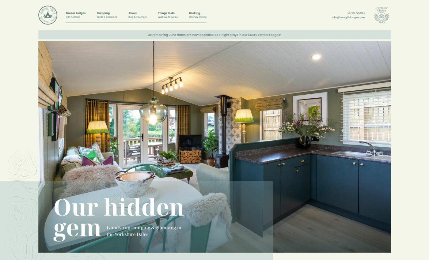
Howgill Lodge is a high-quality camping, glamping, and caravanning site nestled in the heart of the Yorkshire Dales. The site boasts four luxury lodges, each individually designed by award-winning interior designer Jo Bee, and features wood-fired hot tubs and fire pits with pizza ovens. The site also provides a home for a family of alpacas, adding a unique charm to the camping experience.
In 2020, Howgill Lodge was acquired by Cat and Oliver, who envisioned modernising the campsite and enhancing its offerings. Initially updating the website to match on their sister website, Catgill Farm, it became apparent that a substantial revamp was necessary to align with their evolving vision. Their previous website was not fully mobile optimised, lacked a cohesive customer journey, and did not effectively highlight the unique offerings of Howgill Lodge.
Bronco, was commissioned to redesign the website, with the aim of creating a more user-friendly, visually appealing, and informative platform that would effectively showcase the unique offerings of Howgill Lodge and provide a seamless user experience from browsing to booking.
The Challenge
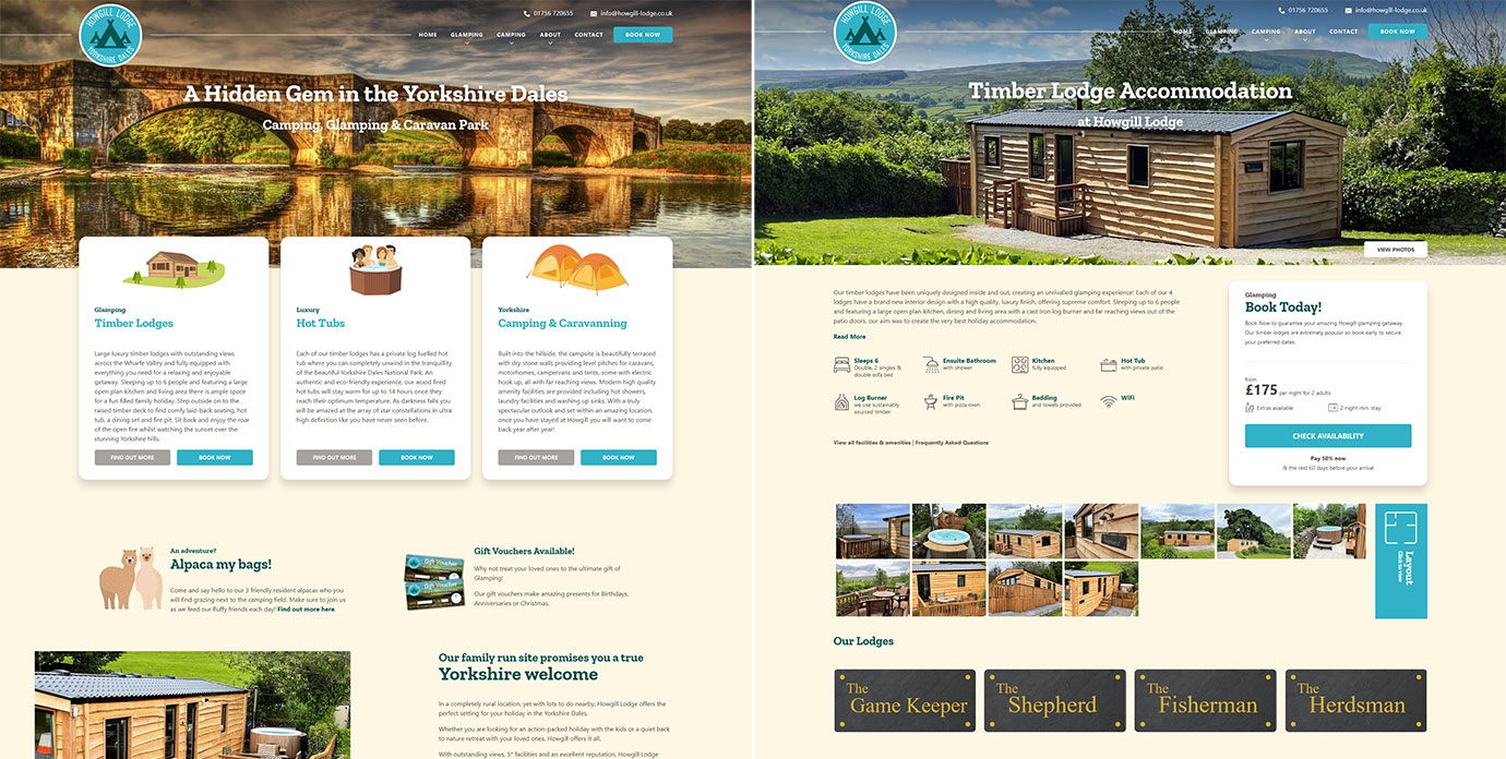
The existing website was complex and cluttered, which was not conducive to the relaxing and enjoyable getaway experience that Howgill Lodge aim to provide. The site was also not fully optimised for mobile use, despite the majority of users accessing the site via mobile devices. Furthermore, the website overly focused on providing information regarding the local area rather than the offerings of Howgill Lodge.
The challenge was to create a website that was visually appealing, easy to navigate, and highlighted the offerings of Howgill Lodge above any supplementary content.
The Solution
Bronco embarked on a comprehensive transformation of the Howgill Lodge website. The journey began with a thorough analysis of the existing site, which informed a strategic roadmap for the redesign. This meticulous approach ensured every detail was carefully considered and implemented, ultimately delivering a superior user experience.
Simplified Layout and Clear Content
With a focus on optimising the mobile experience and the addition of a content management system (CMS), we aimed to design a new layout that was less complex and more intuitive. This approach was not only about improving the physical layout of the website, but also about enhancing the usability and readability of the content itself.
In the original website, information was presented in large blocks of text, which could be overwhelming and confusing for users. We wanted to ensure that the content was not only informative but also easily digestible. To achieve this, we adopted a more concise approach to content presentation. We used clear headings to guide users through the information and broke down larger blocks of text into shorter, more manageable sections. This made the content more readable and allowed users to quickly find the information they were looking for.
We also worked to ensure that the content was meaningful and relevant. We removed any redundant or repetitive information and focused on providing clear, concise details about each accommodation type. This not only improved the user experience but also helped to enhance the website’s SEO performance.
Updated Colour Scheme
Upon reviewing the previous website, we noticed that its bright and saturated colour scheme didn’t align with the expectations of users who might be frequent visitors to Howgill Lodge’s competitors.
While deviating from the norm can help a company stand out, we believed there was room to provide a unique experience while adopting colours that better suited the website’s purpose. We aimed to reflect the tranquil and natural environment of Howgill Lodge more accurately.
In the initial stages, we considered adopting earth tones such as greens and browns for the colour scheme. However, we ultimately decided against this for two reasons. Firstly, the existing colour scheme was primarily blue, and we wanted to maintain some visual consistency with the old website, even if we didn’t retain the exact same shade of blue. Secondly, the Catgill Farm website utilises green as its primary colour scheme, and we wanted to maintain a visual distinction between these two websites.
Enhanced User Experience
If redesigning a website the primary aim should be to enhance the user experience and address any issues identified in the previous version. Simply giving the website a new look without considering these factors would be a missed opportunity and an inefficient use of resources.
One issue we identified in the old website was the prominence of the ‘Book Now’ button over the Glamping and Camping pages in the navigation. While highlighting the conversion point can often be beneficial, we felt this approach didn’t give users the opportunity to fully explore what Howgill Lodge has to offer, potentially leading them to base their decision solely on price. By de-emphasising this button in the navigation, we aimed to guide the user journey towards first learning about Howgill’s offerings and building excitement before moving on to the booking process.
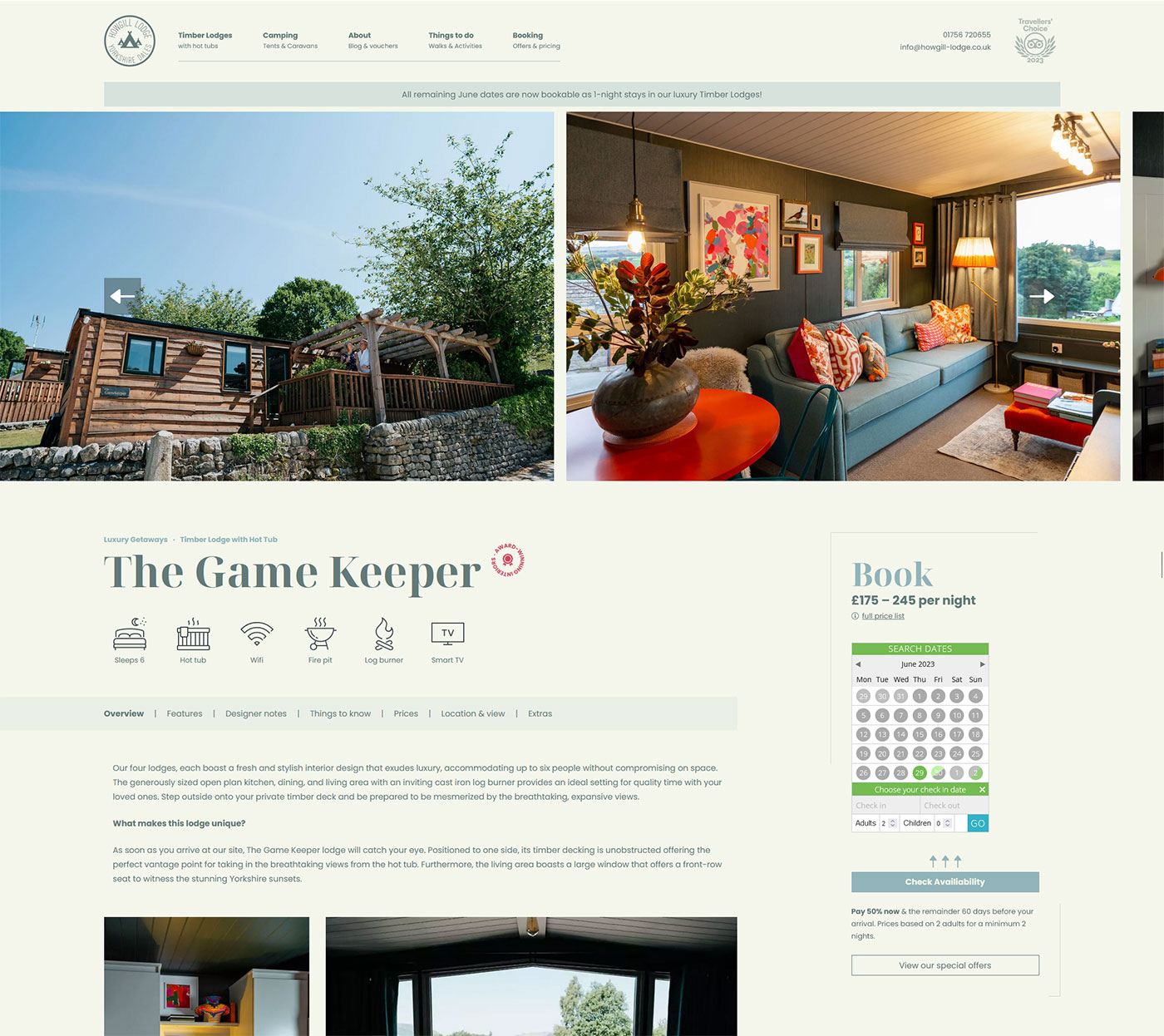
To help pique users’ interest in staying at Howgill Lodge, we focused on providing more detailed information in a clearer format to aid their decision-making process. For the Timber Lodges, this meant splitting the original page into four separate pages, each showcasing the unique interiors and views of the individual lodges. We added extensive details about the amenities within each lodge, its specific location on the campsite, the available extras, and included a few reviews for social proof and trust-building.
Our goal was to ensure that users could find answers to all their questions on this page, thereby enabling them to make an informed booking decision with confidence.
Custom WordPress Theme
Bronco developed a bespoke WordPress theme for the new Howgill Lodge website. This approach ensured that the website was unique and avoided the ‘cookie-cutter’ design often associated with pre-built themes.
In addition to delivering a completely custom design, we were able to overcome the limitations of pre-built themes and significantly improve performance. We eliminated the excessive bloat found in themes that use site builder plugins and reduced the need for additional plugins by recreating certain functionalities natively within the theme. This approach not only made the website more stable for future updates but also reduced potential security risks.
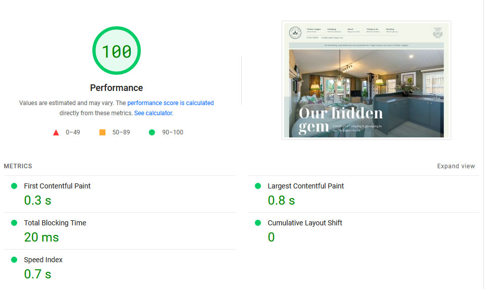
The result is a WordPress website that not only meets the unique needs of Howgill Lodge but also achieves excellent Core Web Vitals scores, a key indicator of a website’s overall user experience.
Use of Subtle Animation
Subtle animations were incorporated throughout the website to provide additional visual interest and enhance the user experience. These animations were designed to be unobtrusive and improve the overall interactivity of the website.
By utilising CSS transitions and effects, we introduced animations that add a touch of dynamism to various elements. These animations include hover effects on buttons, image interactions, and content reveals on hover. Additionally, we implemented CSS scrolling for sliders, enabling smooth touch device swiping and enhancing the overall browsing experience.
The mobile menu was also animated to create a more engaging and dynamic navigation. As users interact with the mobile menu, the links animate with a slight delay, creating a stepped appearance and enhancing the interactivity of the navigation experience.
Throughout the website, we employed subtle animations to create a cohesive and captivating user journey. These animations bring elements to life, adding a layer of engagement and enhancing the overall visual appeal of the website.
SEO Considerations
SEO (Search Engine Optimisation) played a crucial role in the development of the new Howgill Lodge website. We implemented various strategies to improve the website’s visibility in search engine rankings and drive organic traffic.
One of the key steps we took was conducting comprehensive keyword research. Through this process, we identified high-volume search terms that were relevant to Howgill Lodge and its offerings. We not only optimised existing content with these keywords but also recommended the inclusion of new terms that were not previously incorporated on the website. By targeting these relevant keywords, we aimed to improve the website’s visibility in search results and attract more qualified traffic.
In addition to keyword optimisation, we paid special attention to the website’s metadata. We crafted new titles and meta descriptions for each page, ensuring they were compelling, concise, and accurately reflected the content. These metadata elements play a crucial role in attracting clicks from search engine users and conveying the website’s value proposition.
Post-launch, we conducted thorough checks to identify and resolve any potential SEO issues. We ensured that there were no broken or missing pages (404 errors) and that all redirects were properly implemented. This proactive approach helped us maintain the website’s integrity and user experience, which are essential for search engine rankings.
Furthermore, the emphasis on website performance and optimisation had a positive impact on core web vitals scores. By optimising the website’s speed and keeping it lightweight, we aimed to enhance the user experience and improve loading times. These factors not only contribute to a positive user experience but also have a direct influence on Google rankings.
Overall, our comprehensive SEO efforts encompassed keyword research, metadata optimisation, post-launch checks, and a focus on website performance. By implementing these strategies, we aimed to enhance the website’s visibility, attract targeted organic traffic, and improve its overall search engine rankings.”
Improved Information Architecture
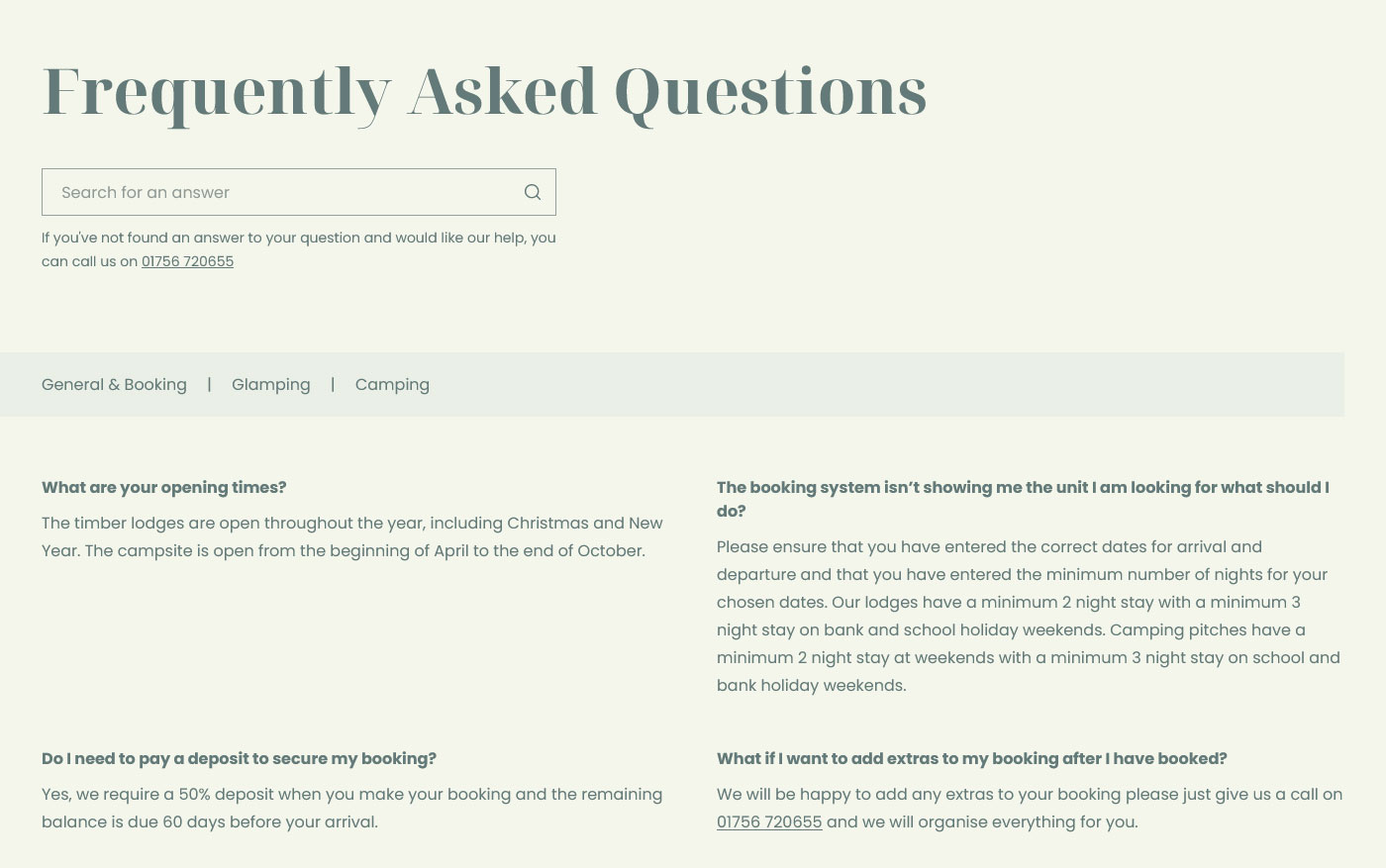
During the development of the new Howgill Lodge website, we re-evaluated our approach to information architecture, specifically regarding the FAQ (Frequently Asked Questions) section. Initially, our philosophy was to distribute relevant information throughout the website’s content pages, believing that if a website was properly structured, users would find the answers they needed within the context of the content.
However, as we gained more experience and insights, we began to question this thinking. We realised that in certain industries and scenarios, having a dedicated FAQ section offers significant advantages in terms of usability and user experience. It provides a centralised resource where users can easily access answers to common questions without having to navigate through multiple content pages.
With this new perspective, we embraced the use of a standalone FAQ section on the Howgill Lodge website. We carefully categorised the FAQs to ensure they were organised and easy to navigate. Additionally, we implemented a search functionality, allowing users to quickly find specific information they were looking for.
The inclusion of a dedicated FAQ section not only improves usability but also has potential benefits for search engine optimisation (SEO). We incorporated FAQ schema markup to enhance the visibility of FAQs in search engine results, increasing the chances of attracting relevant organic traffic.
This experience taught us an important lesson about constantly questioning our decisions and being open to new perspectives. While our initial belief was based on the idea of providing information within the content itself, we realised that a dedicated FAQ section can greatly enhance the user experience and streamline access to crucial information.
It serves as a reminder that in the ever-evolving digital landscape, we must continuously re-evaluate our choices and strive for improvement. What may have seemed like the right decision at one point can be re-examined and refined to align with the changing needs and expectations of users.
The Result
The redesigned Howgill Lodge website has not only undergone a visual transformation but has also achieved significant improvements in usability, engagement, and differentiation from its competitors. The enhancements we implemented go beyond surface-level changes, providing users with a more meaningful and rewarding experience.
The client, Cat and Oliver, have expressed their satisfaction with the modern and clean design that aligns seamlessly with their vision for Howgill Lodge. The website now serves as a solid foundation for them to further expand their business and effectively communicate their offerings to potential customers.
One of the primary goals of the redesign was to highlight the unique features and offerings of Howgill Lodge. The award-winning interior designs of the lodges, which set them apart from standard glamping accommodations, are now prominently showcased on the website. Additionally, the resident alpacas, which add to the distinct charm of the campsite, are also highlighted. These visual representations effectively attract customers who are seeking a truly unique and memorable glamping experience.
The positive reception from the client and the improved differentiation from competitors indicate that the redesigned website is successfully achieving its objectives. By providing a user-friendly and visually appealing platform, we have enhanced the overall perception of Howgill Lodge and positioned it as a standout destination in the competitive glamping market.
Conclusion
The Howgill Lodge website redesign project demonstrates the power of a well-designed website in effectively showcasing a business’s unique offerings and providing a seamless customer journey.
The success of this project underscores the importance of understanding the client’s vision and the unique offerings of the business in designing a website. It also highlights the need for a mobile-friendly design and a seamless customer journey in today’s digital landscape.
Share this case study
Like what you’ve read, then why not tell others about it... they might enjoy it too
