Contemporary Garden Rooms

Contemporary Garden Rooms, known for their bespoke, high-quality timber garden rooms, needed a website that not only looked good but also truly represented their craftsmanship and attention to detail.
Partnering with Bronco, their goal was to transform their online space into something that not only drew in customers but also made them feel right at home with the brand.
Project Goals
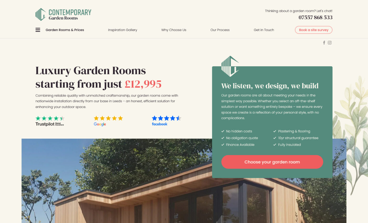
The main aim was to revamp a website that lacked the attention to detail the company puts into the Garden Rooms they construct. The existing website had been aggressively optimised for search engines at the expense of users, while the colour scheme was dark and uninviting.
The challenge was not just in updating the design but in overhauling the entire user experience to make it straightforward, informative, engaging, and better showcase the beauty and bespoke nature of the garden rooms.
Refreshing the Brand
While our focus was primarily on the website, the logo also got a professional facelift to better reflect the modern and high-quality ethos of the brand. This update was about delivering something unique and recognisable in an increasingly competitive market.
The colour scheme underwent changes too. We wanted to give the website a more inviting colour scheme, that still felt consistent with the garden/nature theme. So, it was out with the dark greens and browns, instead replaced with softer shades of green and pastel red as a contrasting colour for call to actions.
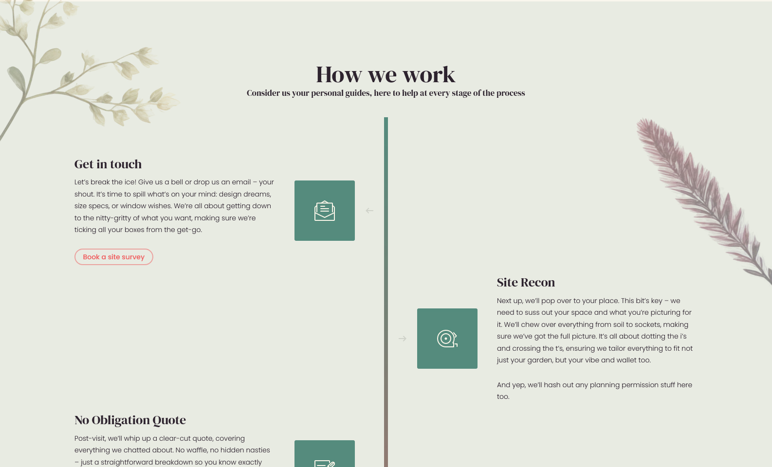
In a creative twist, we also adopted AI technology to generate unique botanical watercolour illustrations that complement the natural themes of garden rooms. These artistic images add a touch of elegance and bespoke charm to the design.
An Honest Approach
A key piece of the puzzle was reshaping how Contemporary Garden Rooms communicates to its customers. The client expressed that as a young business they had to go where the work is, but with young families their aim was to grow in the local area so they can spend less time away from home.
Pricing is also an issue, with bigger competitors able to undercut smaller companies, or offer a sub-standard product to customers who may be less educated on garden rooms.
Together with the client we chose to tackle these potential negatives head on and take an honest, friendly and sincere approach to the content. The new website uses a warm and friendly tone that’s professional yet approachable. It’s about talking to customers as if they’re neighbours over the garden fence — with clarity, honesty, and a bit of personality. This tone helps bridge the gap between professional excellence and the down-to-earth roots of a family-run business.

Educating and Engaging Users
In redesigning the website for Contemporary Garden Rooms, we wanted it to do more than just showcase products; we aimed to share the story and craft behind each garden room. It was about taking potential customers on an educational journey that highlighted the care, quality, and passion that go into every build.
We took a deep dive into the materials used in the garden rooms, not just listing them but explaining why each choice matters. From the sustainably sourced timber to the high-grade insulation, we detailed how these materials contribute to both the durability of the rooms and the environment. It’s important for visitors to understand the thoughtfulness behind each selection, aligning with the values of customers who care about quality and sustainability.
We also made sure to explain what sets Contemporary Garden Rooms apart from others on the market. The website outlines how the flexibility in design—allowing customers to tailor everything from size to finishes—offers a personalisation that you can’t find just anywhere.
This approach aims to make the website a place where visitors come not just to browse, but to learn and connect with the values behind the brand. It’s about building trust and appreciation for the craftsmanship, making sure that when customers choose Contemporary Garden Rooms, they feel confident and excited about their decision.

Simplifying the offering
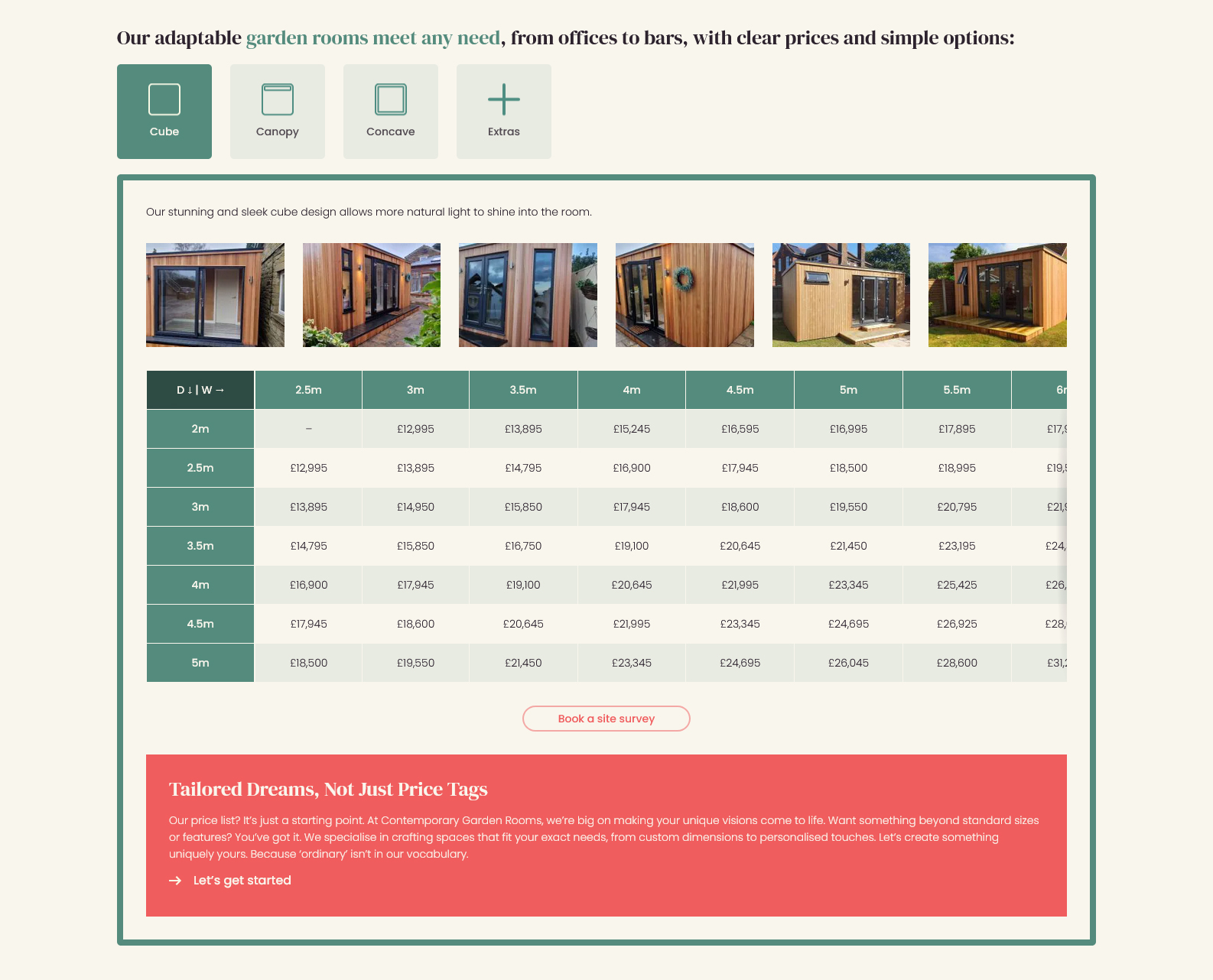
Though previously appearing to be separated into multiple products, in the new website we focused on streamlining the offerings to ensure that visitors could easily navigate through their options without feeling overwhelmed by complexity.
With the exception of a pitched roof on Garden Lodges, all previously listed products were simply different uses of a Garden Room rather than products with distinct differences. Our assumption was these existed purely to attract search traffic rather than extend the options for customers.
By simplifying the array of choices down to a single product, with customisation options, we enhance the user experience and ensure the site remained user-friendly and approachable.
To avoid adversely affecting traffic these alternative products have been retained, reworked and repositioned in the navigation so they continue providing value but not at the expense of user understanding.
This clarity and ease of access ensure that users can explore the offerings without confusion, making the process of choosing a garden room as straightforward and stress-free as possible.
Conclusion
The new website for Contemporary Garden Rooms is a warm, inviting portal that mirrors the quality and bespoke nature of the products they create. Through careful planning, creative digital enhancements, and a focus on user-friendly content, Bronco has helped them deliver a digital experience that we hope exceeds the expectations of their customers.
This project illustrates the power of aligning business objectives with user needs to craft a digital presence that truly stands out.
Share this case study
Like what you’ve read, then why not tell others about it... they might enjoy it too

